[Solved] Chart Recommendation

1 Answer 17 Views
Charts
Benjamin
Top achievements
Rank 3
Bronze
Iron
Veteran
Benjamin asked on 20 Mar 2026, 07:11 AM

Would like to check if this chart is possible using kendo chart

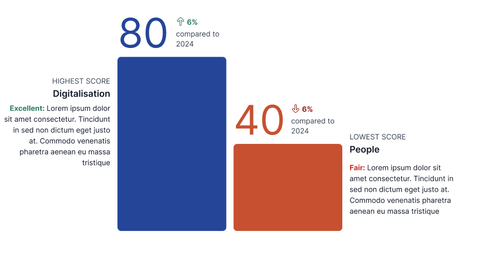
Normal scenario where there is score difference between current and previous year

Chart 1


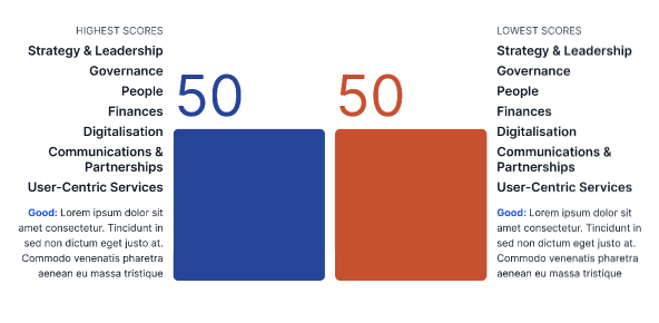
Scenario if multiple domains score the same for highest/ lowest score


Scenario if there is no change compared to the previous report 


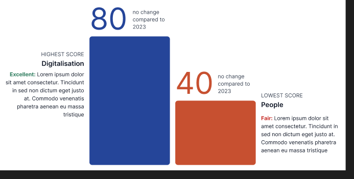
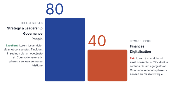
Scenario if all domains score the same for highest/ lowest score

Mobile display


1 Answer, 1 is accepted

Sort by
0
Eyup
Telerik team
answered on 24 Mar 2026, 12:44 PM

Hi Benjamin,


Thank you for reaching out.

Kendo UI for jQuery Charts can visualize all the scenarios you described:

  • Score difference between current and previous year
    You can use a Bar or Line chart with two series—one for the current year and one for the previous year. This will show differences clearly.

  • Multiple domains with the same highest/lowest score
    The chart will display identical bars or points for domains with the same value. You can use custom colors, labels, or tooltips to highlight these cases.

  • No change compared to the previous report
    If scores are unchanged, the bars or points for both years will overlap. Different colors or marker shapes help distinguish series.

  • All domains score the same for highest/lowest score
    The chart will show all bars or points at the same level, making it visually clear that all domains have identical scores.

  • Mobile display
    Kendo UI Charts are responsive and adapt to mobile screens. You can optimize the display with legend placement, tooltip templates, and hiding less important elements.

Here’s a sample initialization for a chart comparing two series (current and previous year):

$("#chart").kendoChart({
  title: { text: "Domain Scores Comparison" },
  legend: { position: "top" },
  seriesDefaults: { type: "bar" },
  series: [
    { name: "Current Year", data: [80, 90, 70, 90] },
    { name: "Previous Year", data: [70, 90, 70, 90] }
  ],
  categoryAxis: { categories: ["Domain 1", "Domain 2", "Domain 3", "Domain 4"] },
  valueAxis: { min: 0, max: 100 },
  tooltip: { visible: true, template: "#= series.name #: #= value #" }
});


I hope this will prove helpful.


    Regards,
    Eyup
    Progress Telerik

    Love the Telerik and Kendo UI products and believe more people should try them? Invite a fellow developer to become a Progress customer and each of you can get a $50 Amazon gift voucher.

    Benjamin
    Top achievements
    Rank 3
    Bronze
    Iron
    Veteran
    commented on 25 Mar 2026, 03:51 AM

    hi,

    i am looking for a possibility of the exact same design as my screenshot

    Tags
    Charts
    Asked by
    Benjamin
    Top achievements
    Rank 3
    Bronze
    Iron
    Veteran
    Answers by
    Eyup
    Telerik team
    Share this question
    or